![HOTELROMEO [2026 Ro Soft Merge]](http://images.squarespace-cdn.com/content/v1/68d154032c5eb30eb8b894e0/43696dc8-762b-4fb2-992b-341f083b14d8/HTL+%3A+RO+Merge.png?format=1500w)
FEATURED WEB PRODUCT WORK OVER THE PAST DECADE.
From 2014 to 2025, this timeline traces a decade of evolving design — from handcrafted systems to AI-driven frameworks. Each project reflects balance, clarity, and experimentation, mapping a continuous journey of process, geometry, and creative evolution.
-
![]()
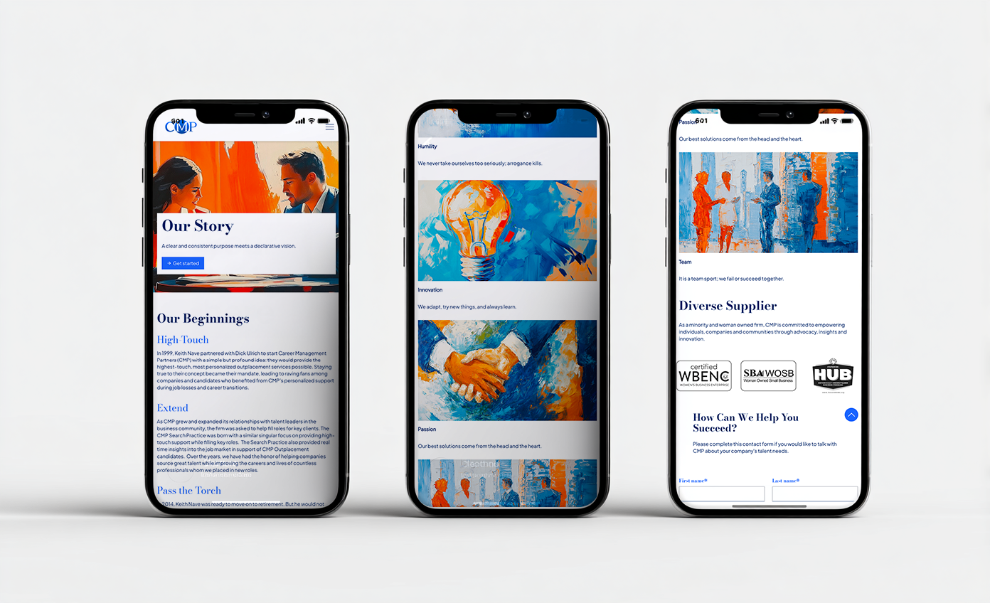
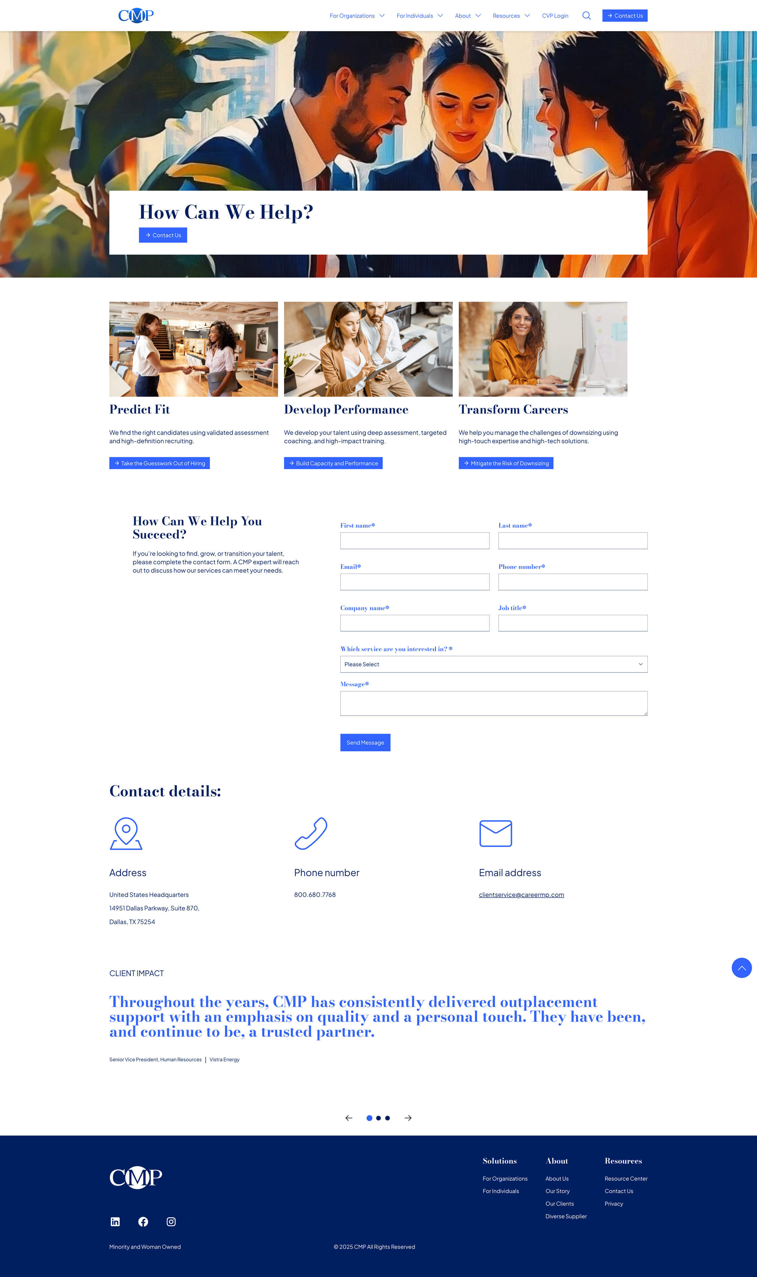
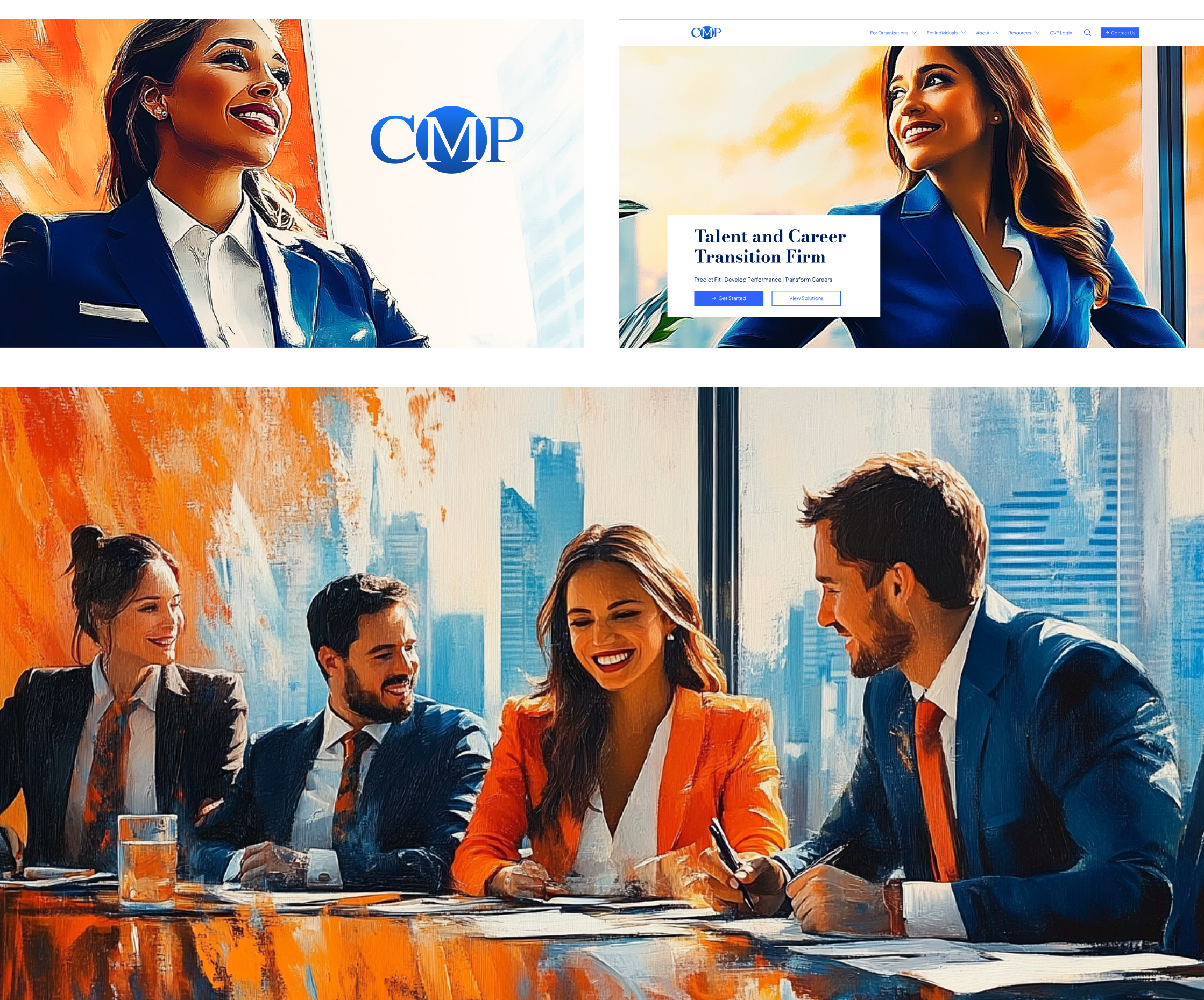
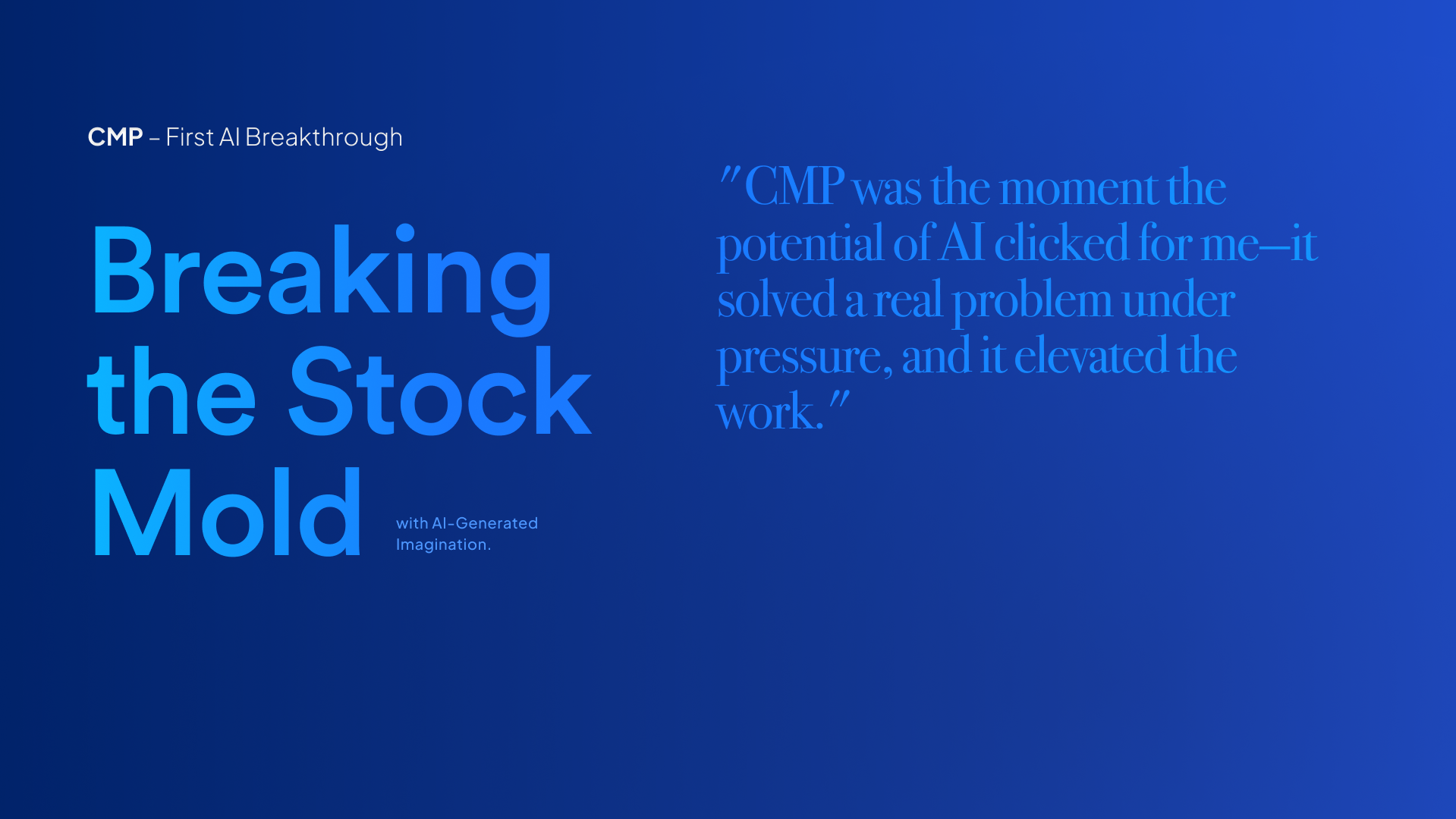
2024/CMP B2B WEB
Breaking the stock mold for CMP’s B2B site — replacing generic visuals with AI-generated imagery that added colour, warmth, and imagination to an otherwise traditional corporate experience.
-
![]()
2014 /AIR FREIGHIT AUSTRALIA
A complete visual redesign for AFI.com — merging illustration and digital motion to craft a clean, accessible experience built around flow, hierarchy, and human-centred storytelling.
-
![]()
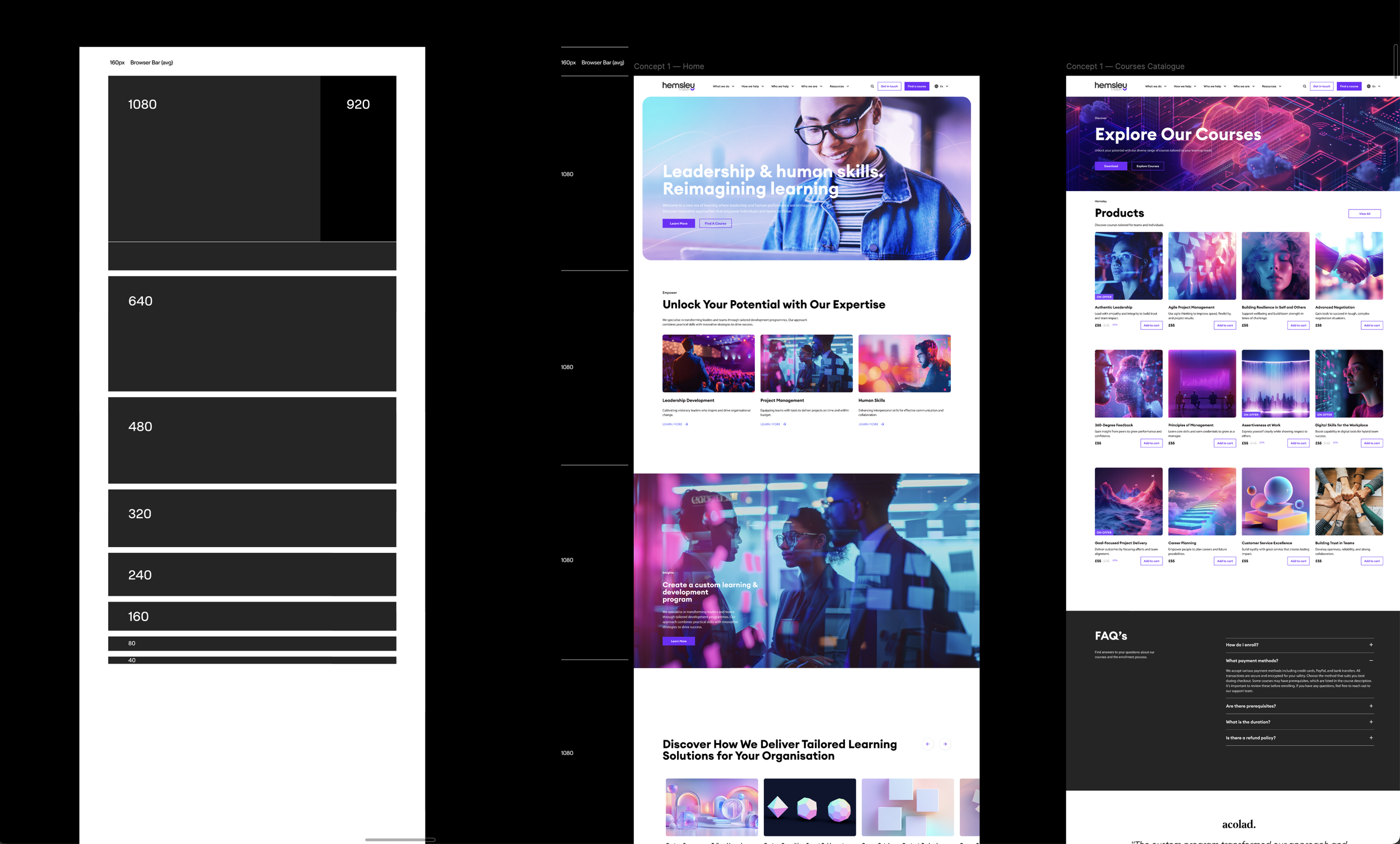
2025 /HEMSLEY WEB DESIGN (ATOMIC)
A full redesign built under pressure, powered by AI pipelines. From wireframe to launch, the system automated content, imagery, and structure — turning complex delivery into seamless end-to-end design.
-
![]()
2016/WEB DESIGN KYP
A full redesign for KYP Amsterdam, focused on clarity, precision, and motion. The project modernised their digital presence through handcrafted vector systems and refined UI structure.
-
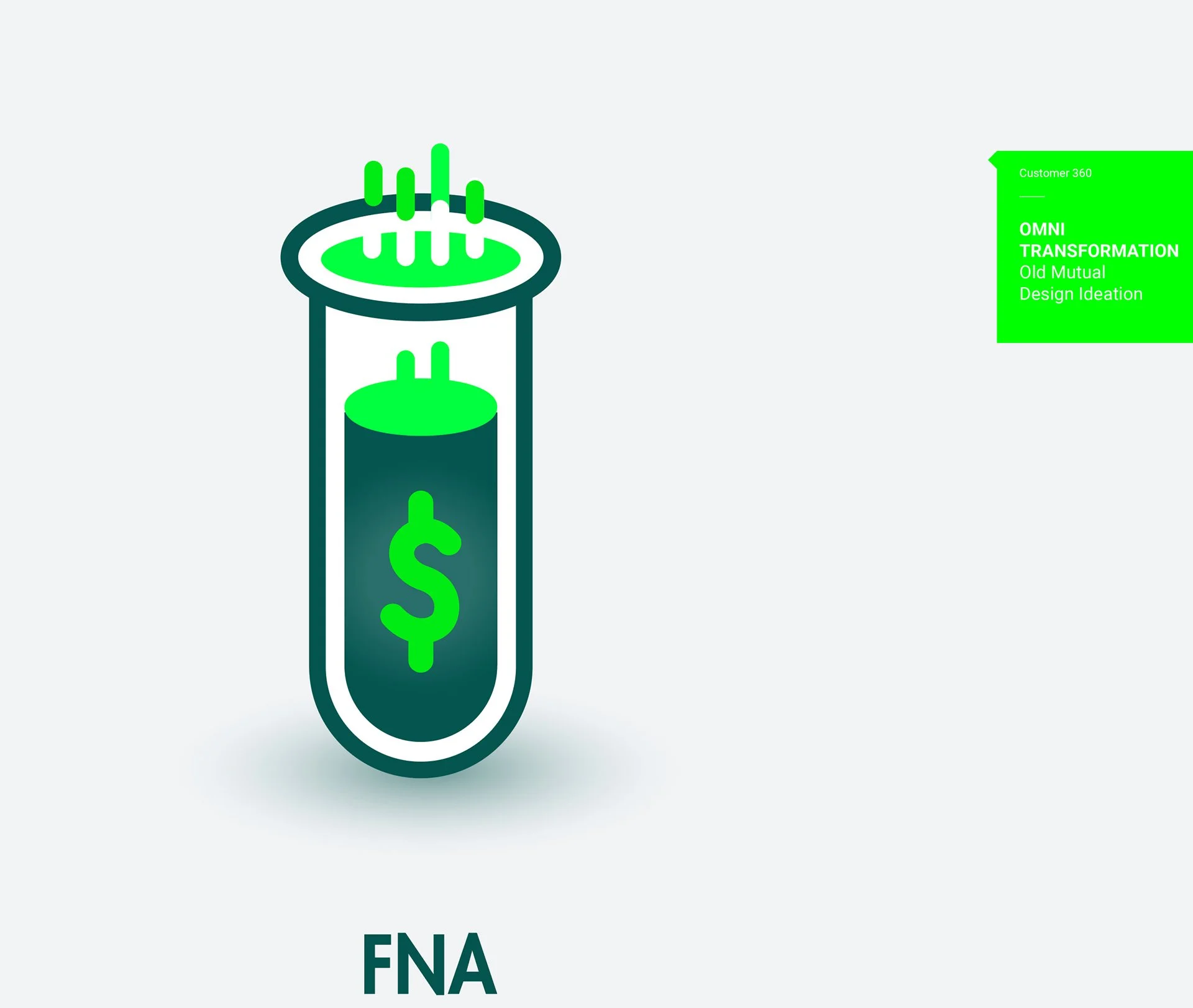
![]()
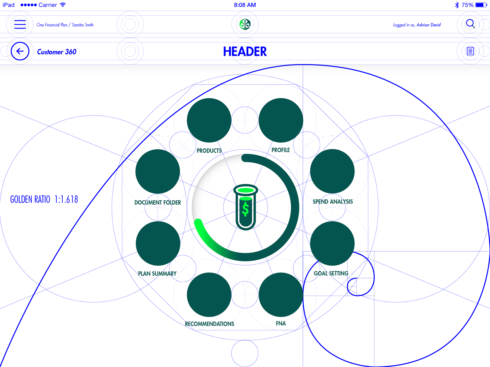
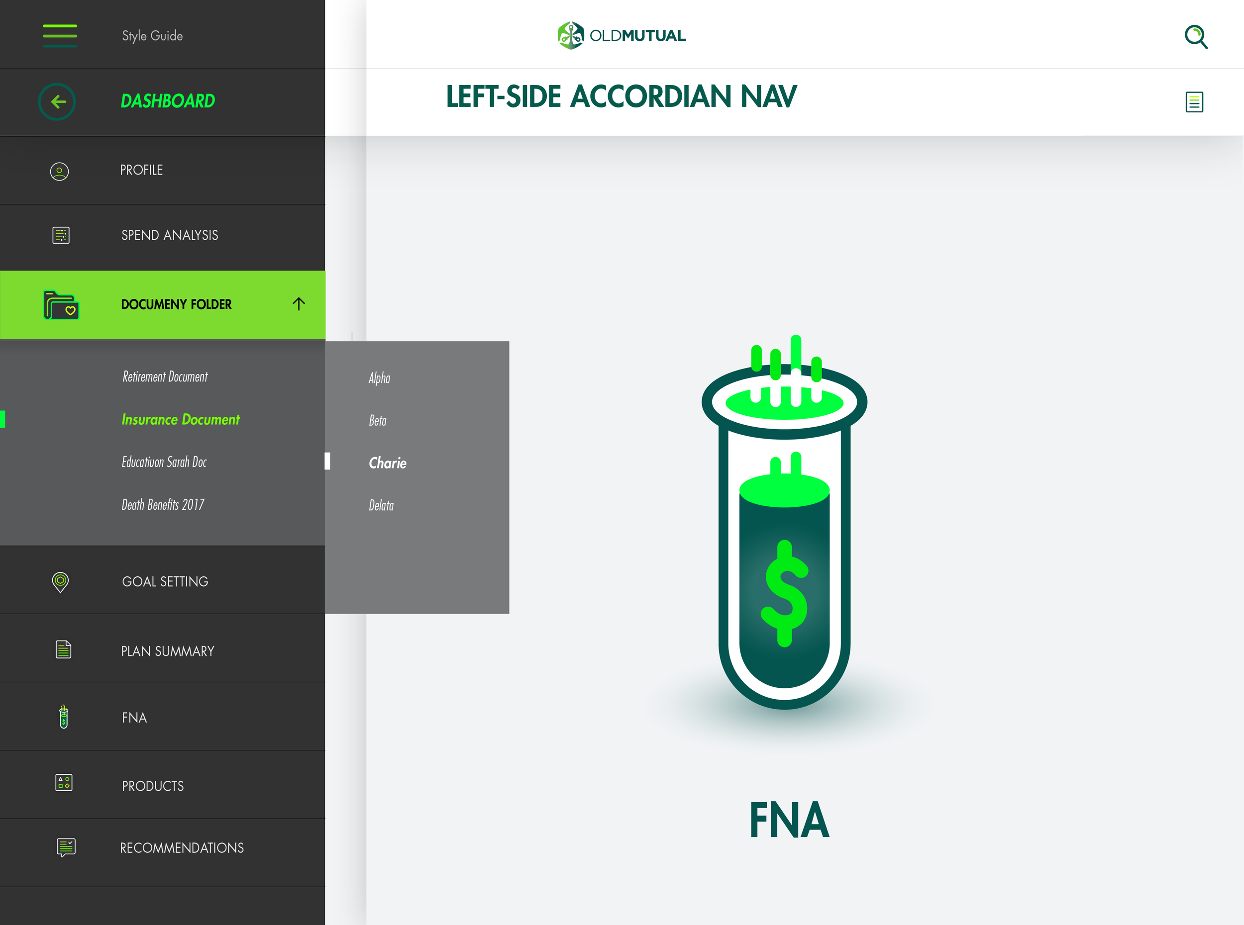
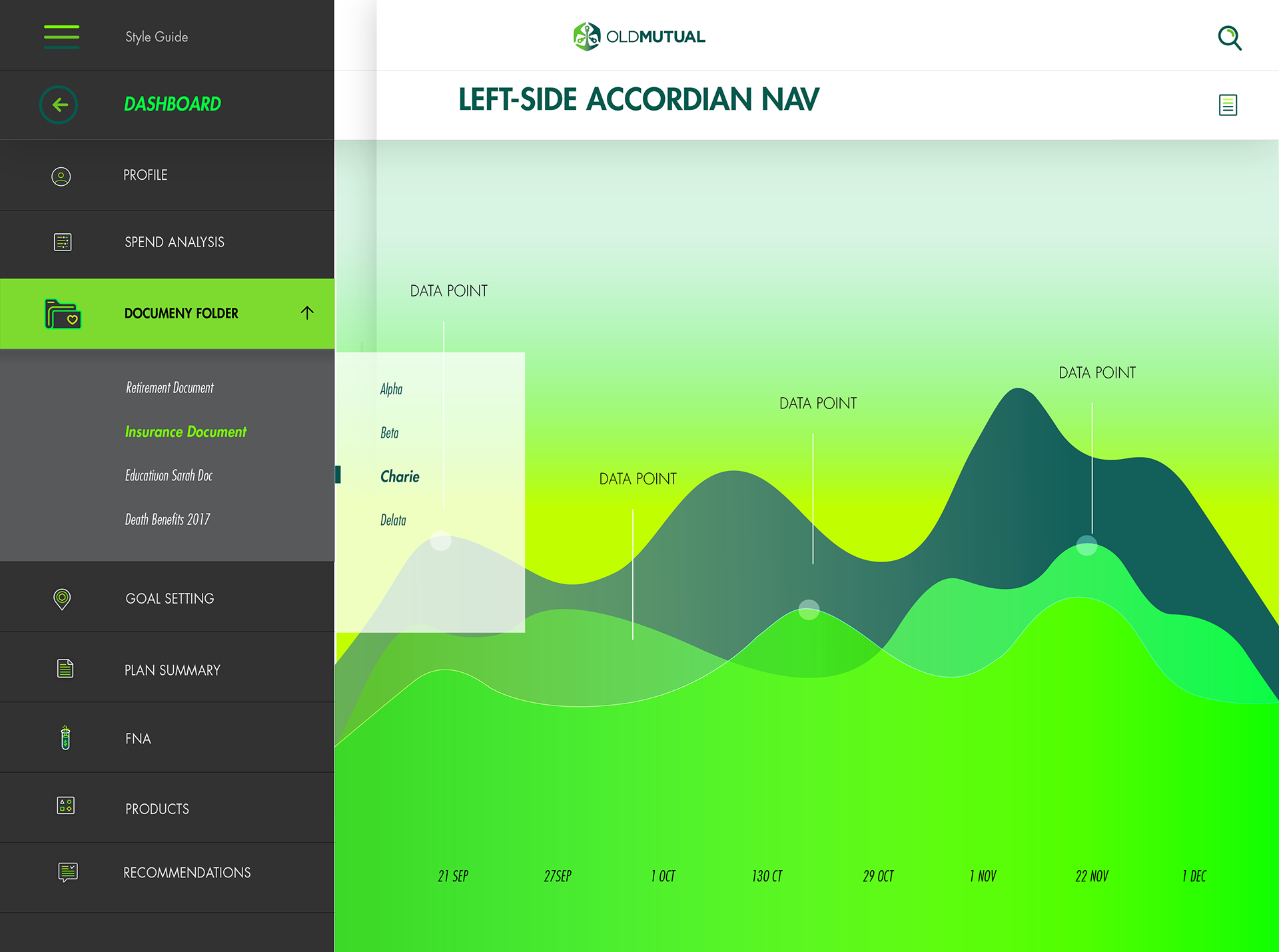
2016/OLD MUTUAL OMNI CUSTOMER 360 DASH
Developing a circular dashboard for Old Mutual’s Customer 360 platform — merging data, geometry, and design. Built to visualise user journeys through balance, rhythm, and simplicity.


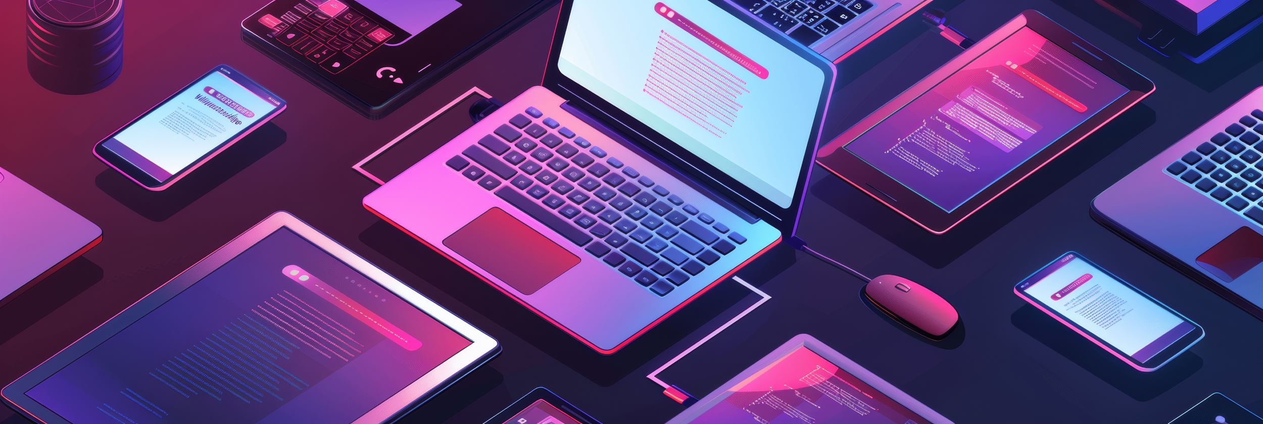
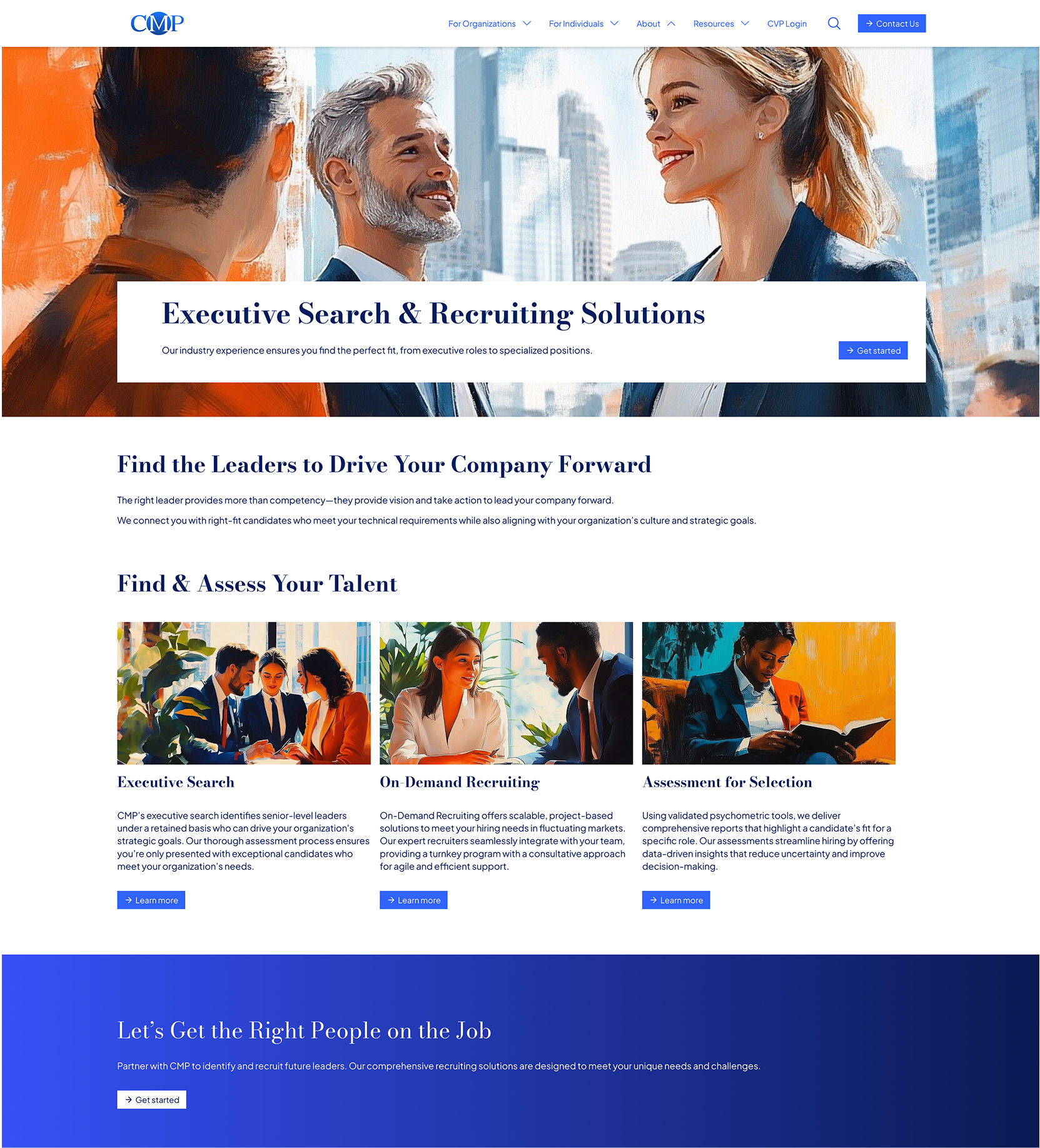
2024//CMP — TALENT AND CAREER TRANSITION FIRM
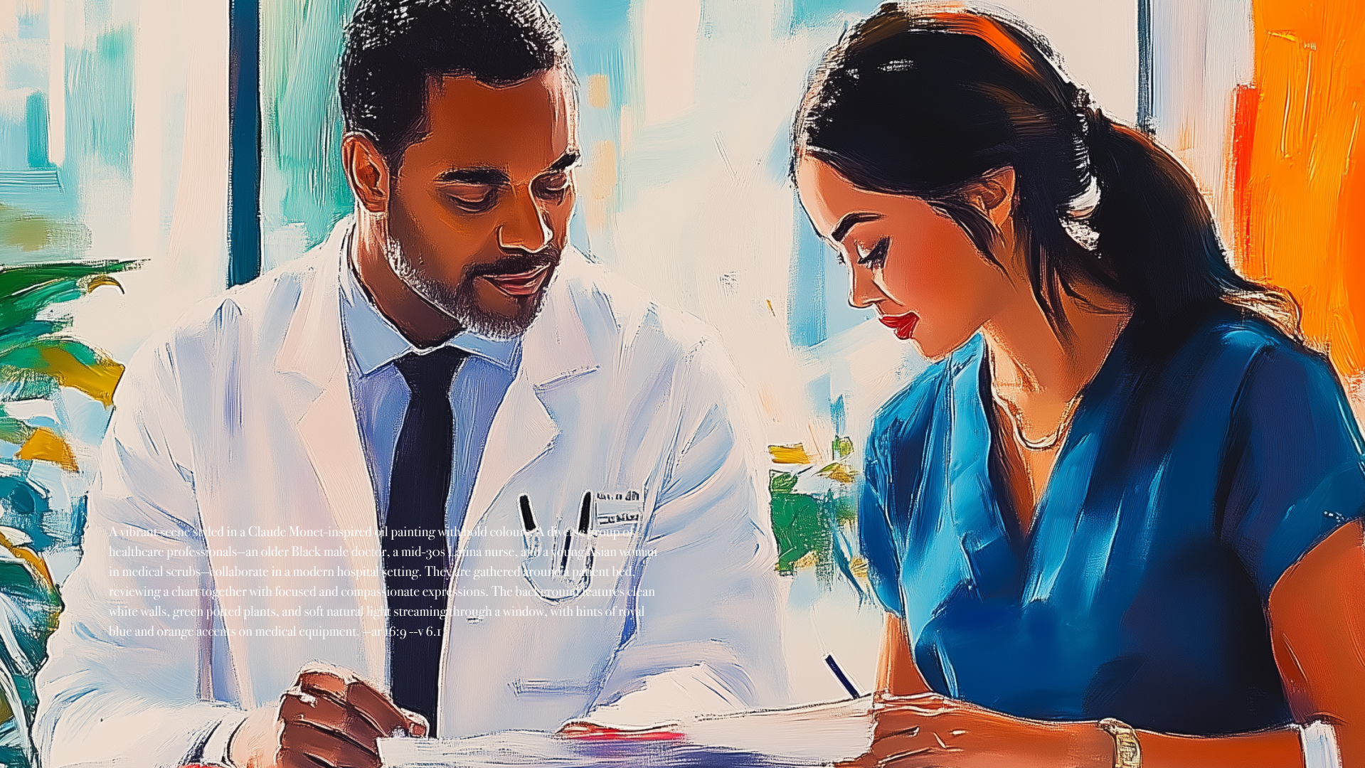
CMP (Career Management Partners) is a leadership and career transition firm focused on people, progress, and potential — values that demanded a visual language as human as their mission.

When I joined the project, the challenge was clear: elevate the site’s visual identity while breaking free from the generic, overused stock imagery common to B2B and HR-driven brands.
Midjourney became my unexpected breakthrough. What started as a quick workaround to test alternative imagery evolved into a creative collaboration between human direction and machine interpretation. The AI wasn’t replacing design — it was extending it.
Through prompt-driven exploration, I crafted painterly, human-centred scenes that reflected CMP’s core values of empathy, collaboration, and leadership. Each image was generated, refined, and composited to maintain realism while introducing emotional texture — a blend of brand clarity and expressive warmth. The results brought life to a corporate ecosystem that often feels sterile.
This experiment shifted the project — and my perspective. AI became less about automation and more about augmentation. It accelerated ideation, unlocked creative range, and revealed new ways to tell human stories through synthetic tools.
CMP was the first project where AI and brand strategy intersected in real time. Under pressure, it delivered a visual solution that was faster, more original, and emotionally resonant. It showed how, when guided by design principles, AI can help reimagine what brand storytelling looks like in the modern digital landscape.
Looking back, CMP was the moment AI truly clicked for me — not as a shortcut, but as a co-creator. It solved a real creative problem, enhanced the brand’s voice, and opened the door to new modes of design thinking that now define my ongoing work.
2016//WEB DESIGN KYP AMSTERDAM DESIGN// KYP AMSYTERDAM
KYP Project helps construction companies plan smarter and build better. Based in Amsterdam, their platform transforms complex schedules into visual clarity — giving teams full control over time, progress, and collaboration.


Handcrafted Design —Created entirely by hand in Adobe Illustrator — a study in precision, control, and the enduring value of human craft in a digital age.
The brief was to redesign the digital experience while honouring the brand’s distinctive language — its custom typography, iconography, and structural precision. The challenge wasn’t reinvention but refinement: to modernise without losing identity.
I worked across UI, motion, and design direction, using KYP’s bespoke geometric icons as the foundation for a modular navigation system. Each symbol was redrawn and animated to express progress — upward movement, connection, completion. These small visual gestures reflected the rhythm of construction itself.
The site was built as a visual framework — bold, minimal, and responsive allowing KYP’s tools and product to take centre stage. The interface carried through their brand ethos of clarity through structure, aligning colour, grid, and motion into a seamless hierarchy.
What emerged was a system-driven identity: clean lines, calm rhythm, and precision in every interaction. A digital experience that captures the same values that guide the physical world of construction collaboration, progress, and structure that stands the test of time.
REFLACTION — ANALOG TO AI
Revisiting this project in 2025 felt like closing a creative loop. Ten years later, I was able to rework and reimagine the same system in minutes using AI — a process that once took weeks of hand-rendering. Yet, even with AI’s speed and scale, the essence of the original work remains irreplaceable.
As an artist, I’ve come to see AI not as a threat but as a new instrument — one still learning its own language. The tools evolve, but the creative instinct doesn’t. Illustrator will never disappear, because the real art the eye, the hand, the decision-making can’t be automated. AI may accelerate process, but craft remains the foundation.
This project stands as a quiet case study in coexistence: analog and AI, discipline and discovery. The handmade and the generative two sides of the same creative continuum.
Hybrid Design — Made with AI Created in collaboration with AI-driven tools — a study in speed, scale, and the evolving relationship between intuition and technology in modern design.
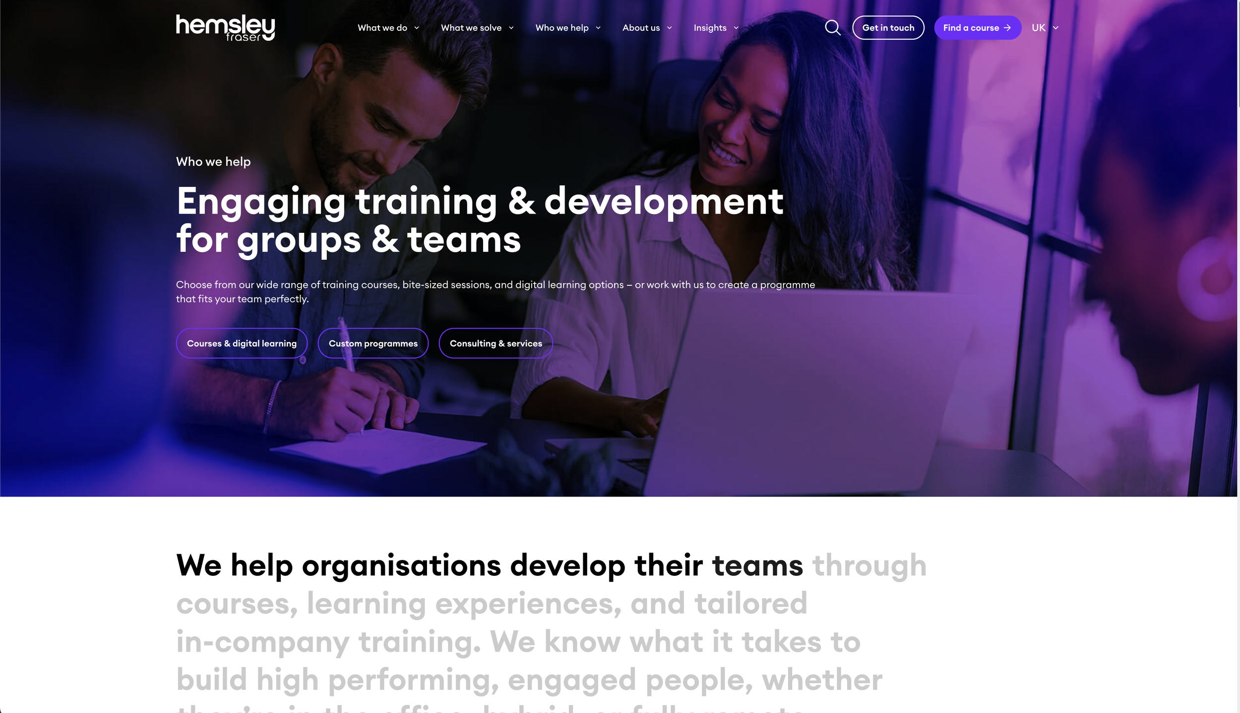
HEMSLEY FRASER END TO END WEB DESIGN


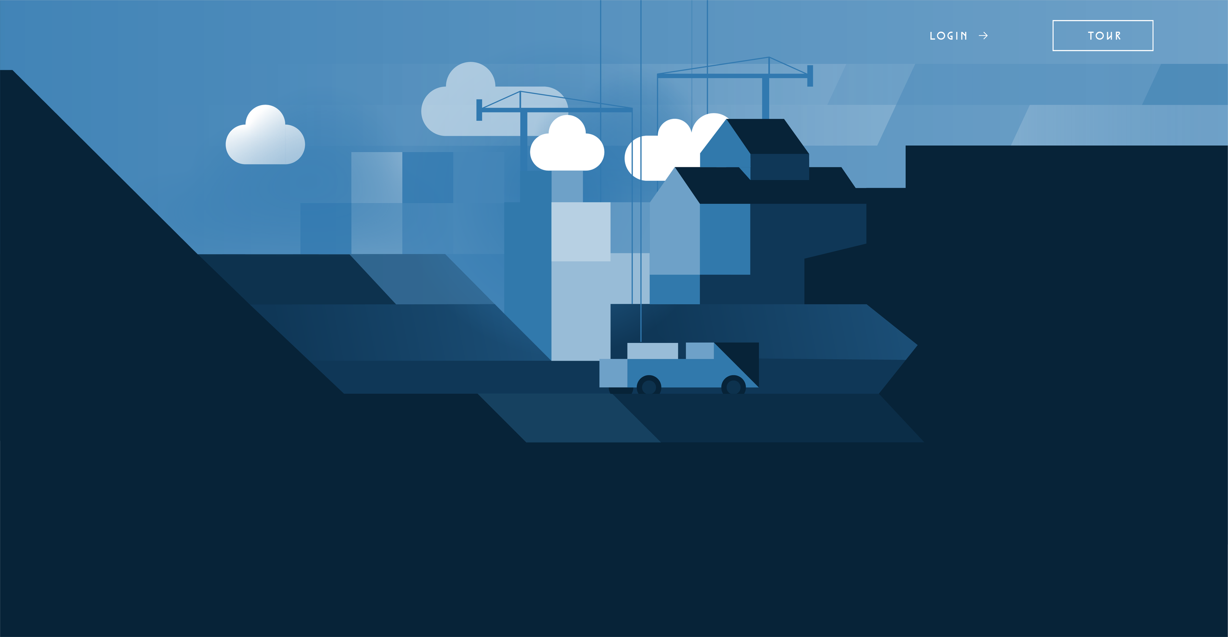
2014//DESIGN DIRECTION AFI.COM
Airfreightit was designed to assist customers and businesses in being able to obtain a competitive quote to move their freight in one place.


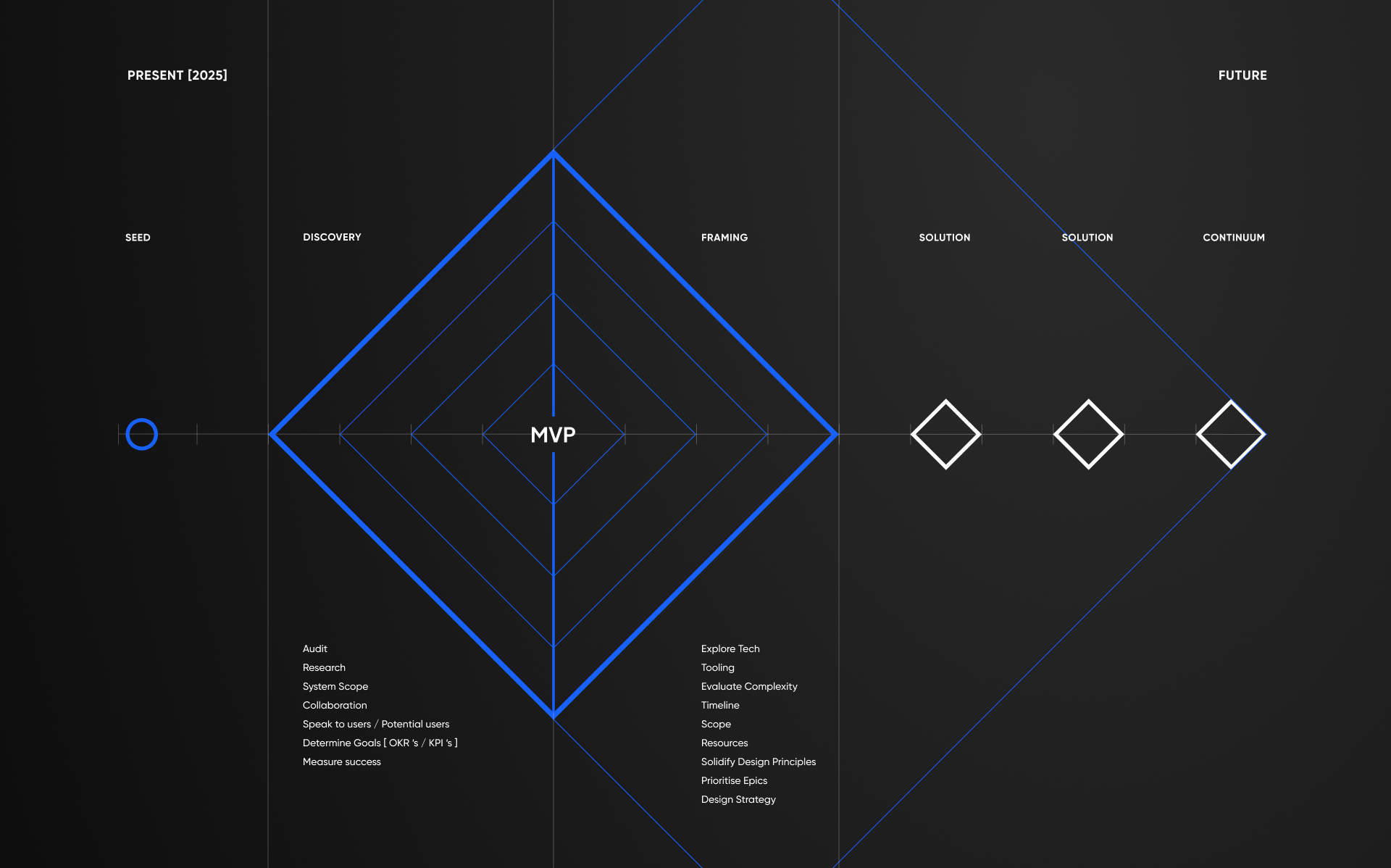
OM OMNI DASHBOASH DESIGN
2016
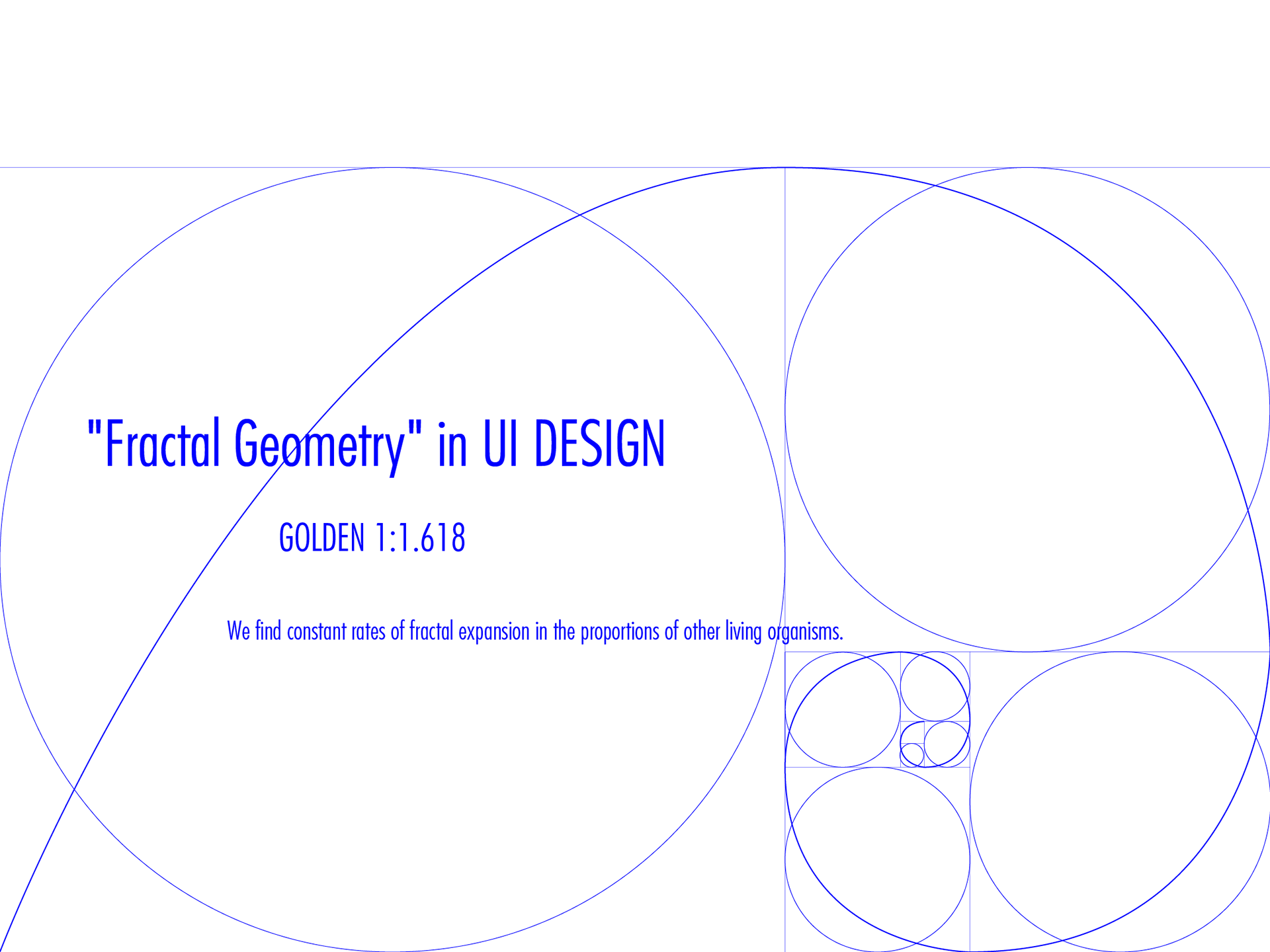
Product Design | Fractal Geometry in UI
As UI Design Lead for Old Mutual’s OMNI CX platform, I was responsible for defining the product’s visual identity, dashboard system, and overall design language. The goal was simple but ambitious — to bring structure and clarity to complex financial data through an interface that felt fluid, intuitive, and human.
The Customer 360 dashboard was conceived as a single, intelligent view of a client’s financial world. Inspired by the golden ratio (1:1.618), I developed a circular, fractal-based layout that gave form to Old Mutual’s philosophy of balance, growth, and connection. This geometric framework became both visual language and navigational logic — a system where data expanded and contracted naturally, mirroring the rhythms of financial decision-making.
Every element — from typography and spacing to motion and data visualisation — was informed by proportion and harmony. Working across teams of UX designers, engineers, and product strategists, I created component libraries and design guidelines to ensure consistency and scalability. The process also extended into motion design, where transitions reflected continuity and calm rather than noise or interruption.
The result was a dashboard that transformed static data into a living, interactive narrative — a tool for insight as much as information. It united form and function, showing that mathematics and design could coexist as both system and story.
The Customer 360 project stands as a case study in system-driven design: where geometry meets empathy, and where design turns data into understanding.