![HOTELROMEO [2026 Ro Soft Merge]](http://images.squarespace-cdn.com/content/v1/68d154032c5eb30eb8b894e0/43696dc8-762b-4fb2-992b-341f083b14d8/HTL+%3A+RO+Merge.png?format=1500w)


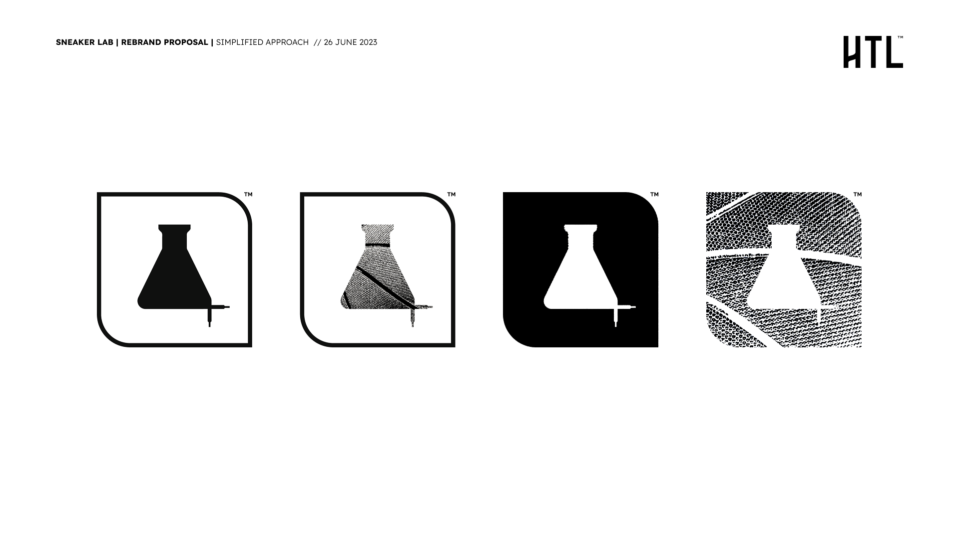
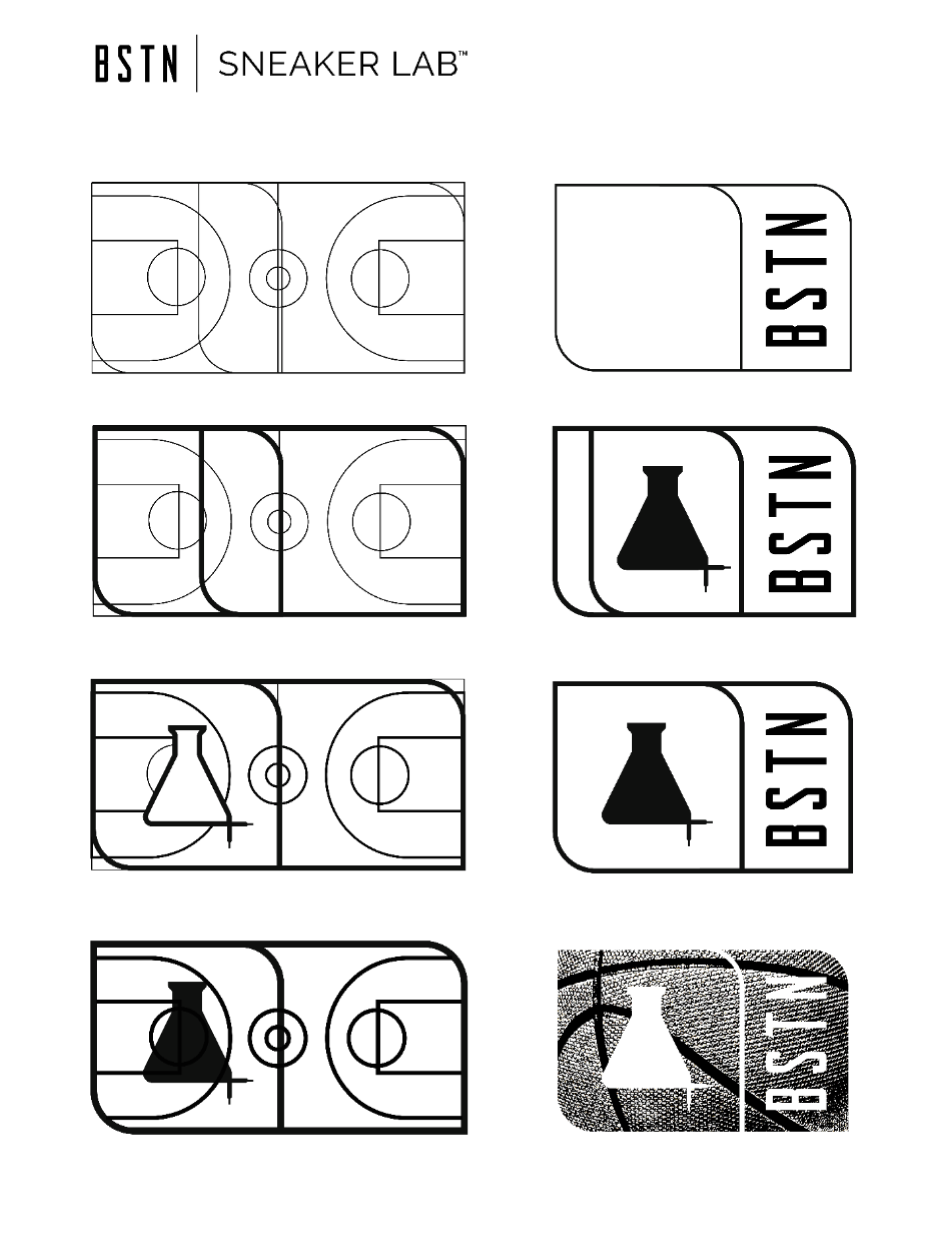
The evolution of the mark became a study in pattern and perception.
Each iteration of the flask explored how contrast, texture, and negative space could express Sneaker Lab’s core idea: science made human. From pure form to patterned expression, the symbol shifted from functional to iconic — a visual shorthand for clarity, experimentation, and endurance.
Sneaker Lab — Brand Redesign
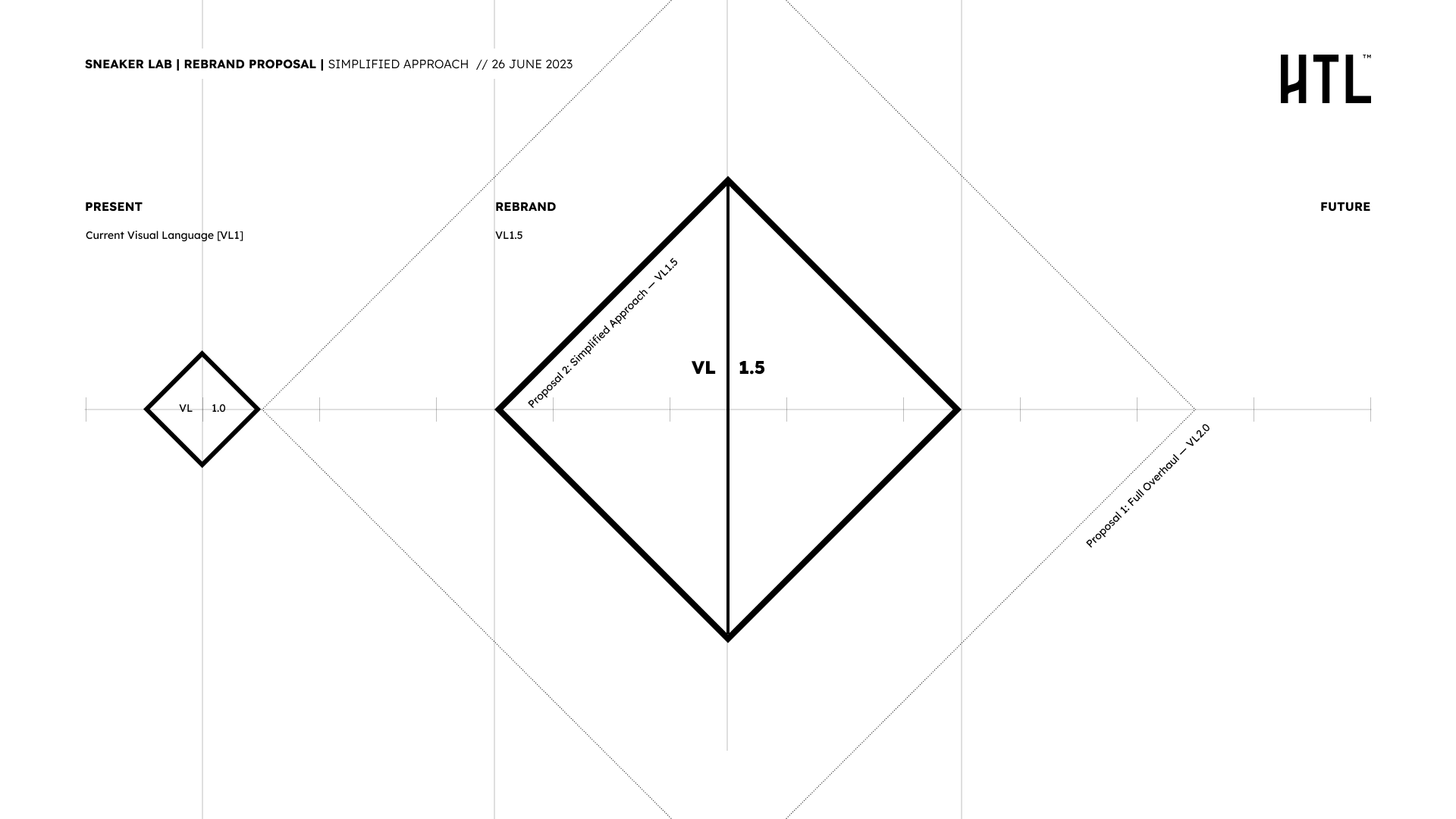
#6 | Sneaker Lab — Brand Redesign Refinement through reduction, Packaging redesign and visual language overhaul case study
The redesign was guided by the principle that every great brand begins with a pattern — a visual axiom that embodies both clarity and intelligence. For Sneaker Lab, that meant revisiting its core equation:
X = LAB + Y¹ + Y² + Y³
Each variable represented a design layer: the core lab identity, new category extensions, and the visual system connecting them. The challenge was to solve for X — how these variables coexist within one coherent pattern.
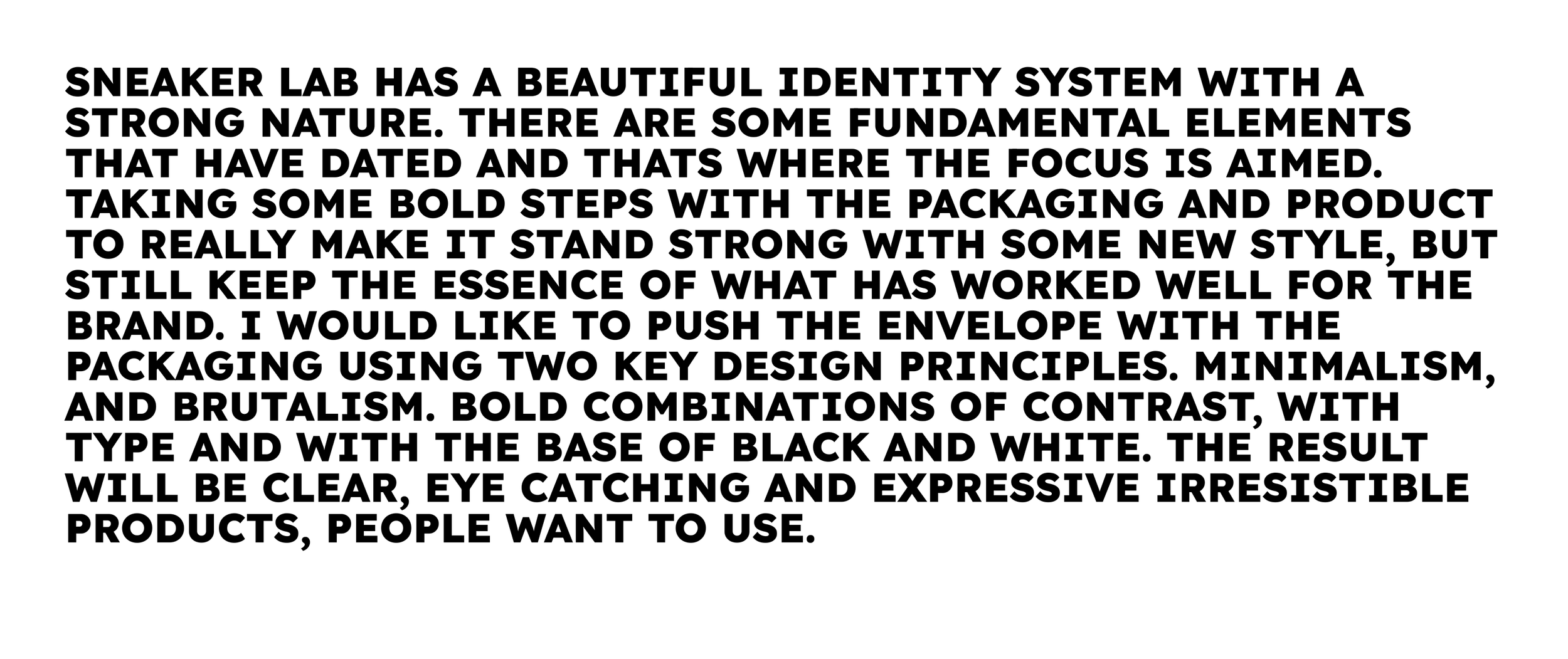
Drawing from Gestalt and minimalism’s evolution into brutalism, the project treated simplicity as structure, not absence. It reduced the visual load while amplifying comprehension — precision as poetry. By applying principles like proximity, balance, and continuation, the framework created a new form of recognisability: timeless, scientific, and inherently human.
The result was a redefined anatomy of design — a system that transforms brand recognition into a living equation.
The evolution of the mark became a study in pattern and perception. Each iteration of the flask explored how contrast, texture, and negative space could express Sneaker Lab’s core idea: science made human. From pure form to patterned expression, the symbol shifted from functional to iconic — a visual shorthand for clarity, experimentation, and endurance.


BSTN
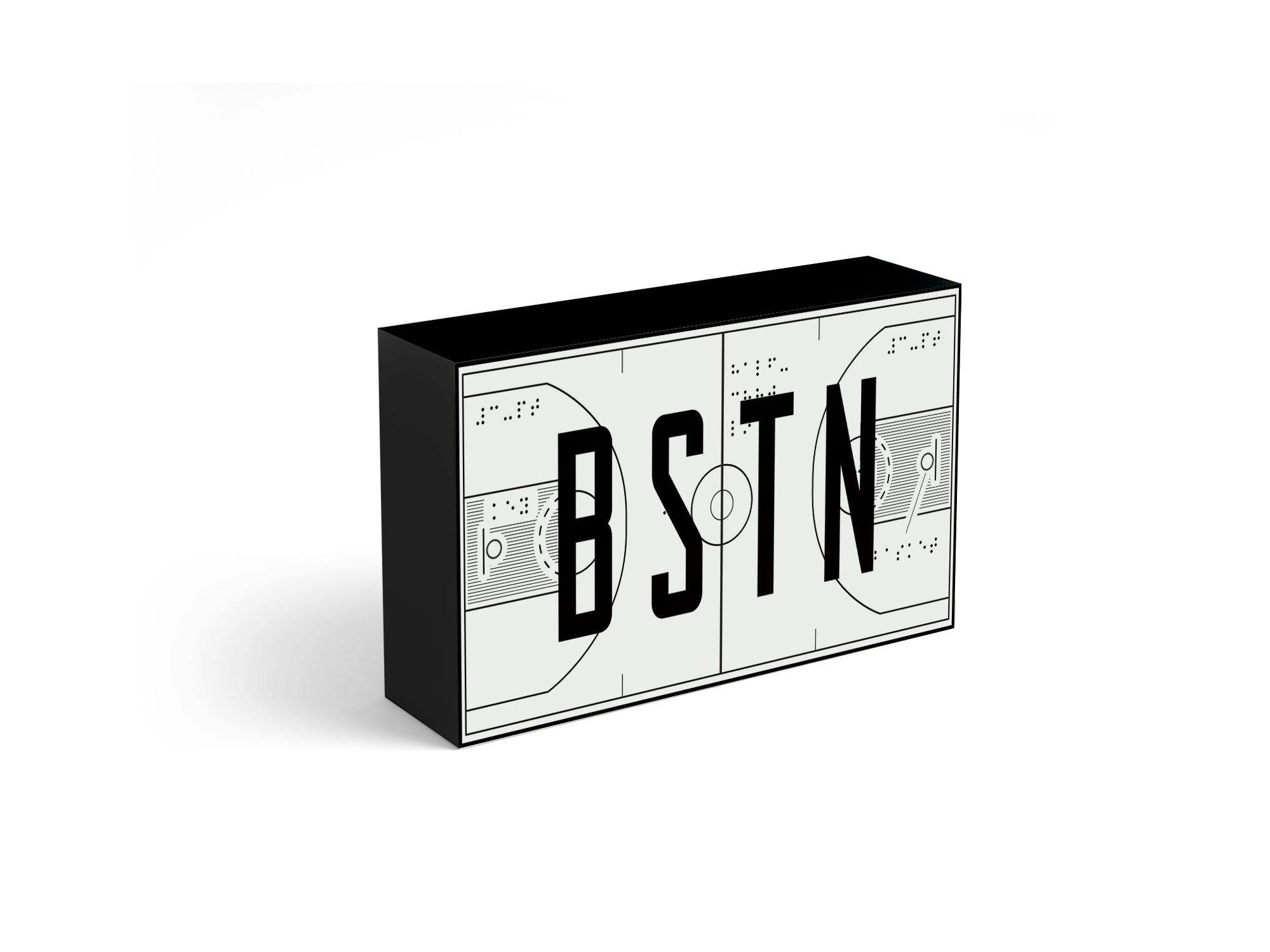
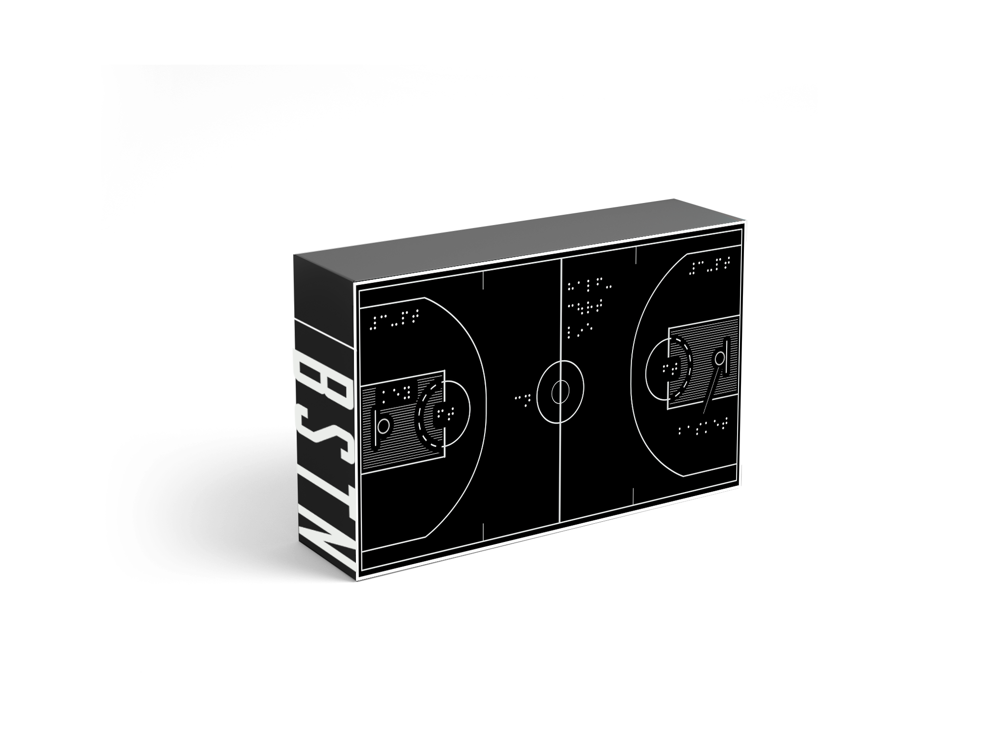
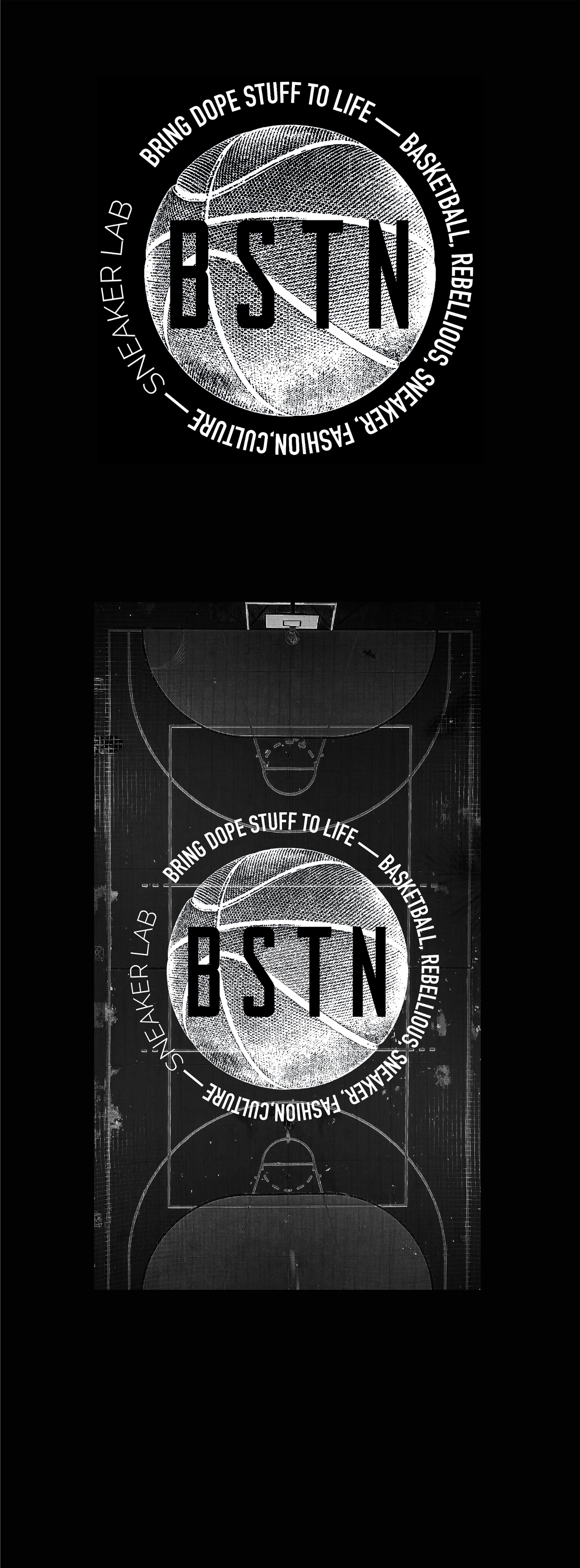
#7 | Sneaker Lab × BSTN — Co-Lab Packaging System
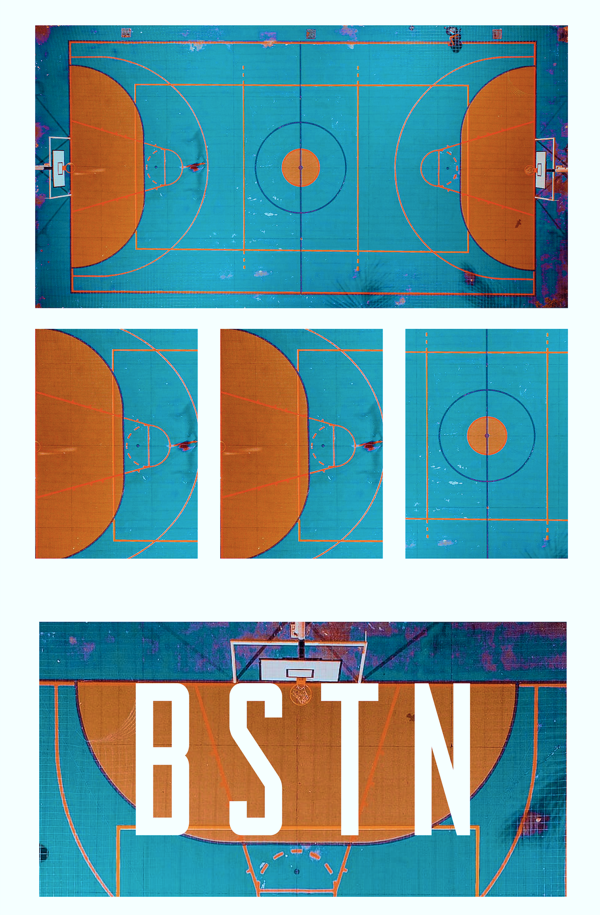
The BSTN partnership represented Sneaker Lab’s outward expression — The idea of wrapping a court around the box felt instinctive. A basketball court carries its own beauty—lines, grids, arcs, and balance; geometry in motion, a rhythm of math and play.
Translated into packaging, that geometry turns the sleeve into more than a container—it becomes part of the story. The court’s precision shapes design clarity, while the bold BSTN typography grounds it in identity. Functional yet poetic, the box is both a vessel for shoes and a canvas that holds the game itself.


YOUR BRAND
YOUR BRAND
This project explored how Sneaker Lab’s refined visual system could flex into partnership mode without losing integrity. The co‑lab packaging balanced neutrality with energy — minimalist grids, confident typography, and deliberate contrast. It treated collaboration as narrative: every pack a shared statement between innovation and identity.
Built on the foundation of the new visual language, BSTN became the proof of scalability — the system holding firm while allowing personality to emerge.
“The idea of wrapping a court around the box felt instinctive.”

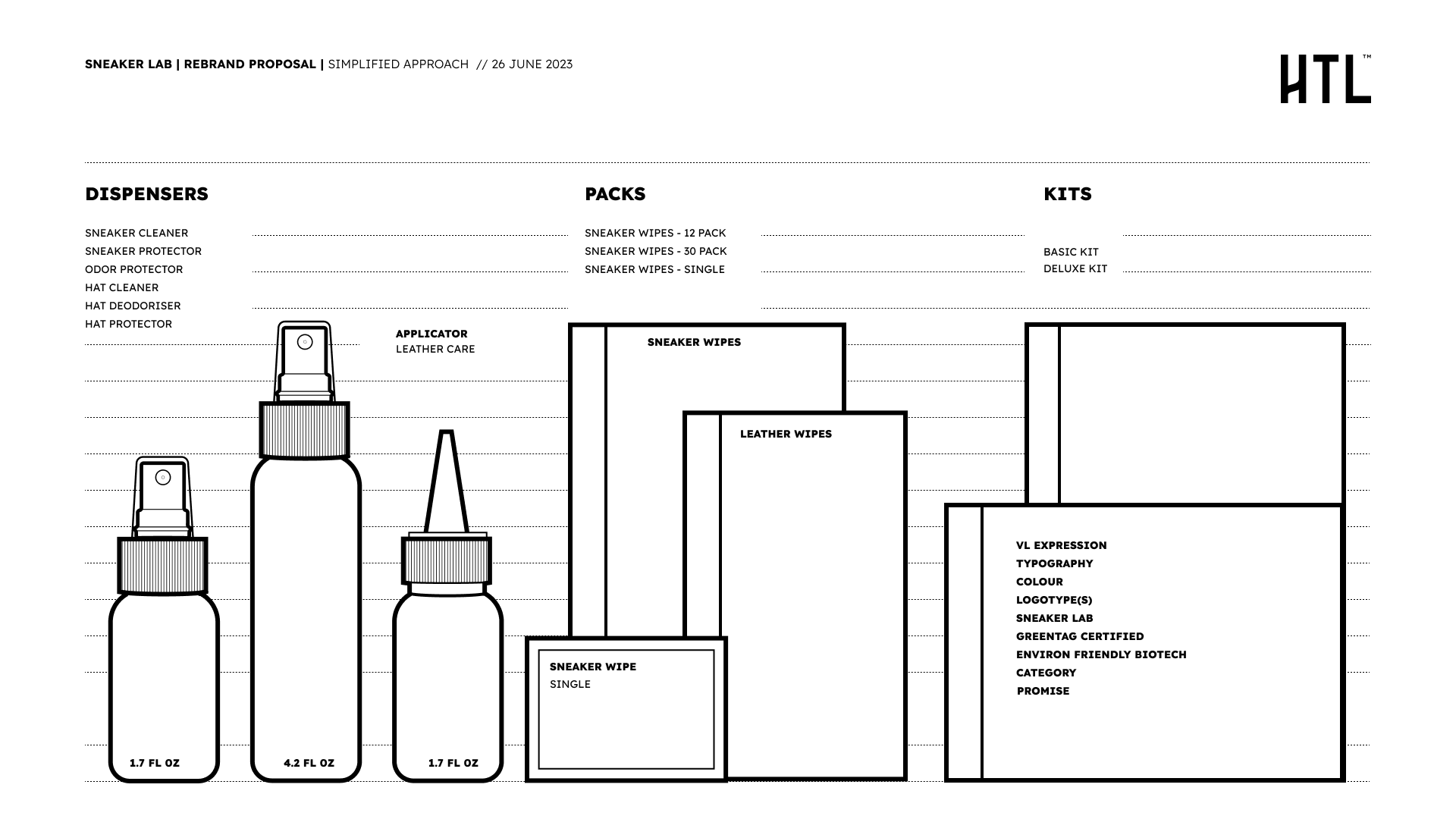
Take a minute to write an introduction that is short, sweet, and to the point.